Disruption guru Christensen: Why Apple, Tesla, VCs, academia may die
VCs aiming too high
Christensen said he thinks the venture capital world needs to be disrupted because it is focused too much on making big killings on big investments at a time when there are plenty of good smaller investments to be made on companies that will be disruptive.
He offered as an example his friend, former Massachusetts Gov. Mitt Romney. Before teaching, Christensen ran a small company in Massachusetts at the same time Romney started Bain Capital, and the firm invested $1 million in Staples when it was just starting out.
Romney actually took the time to call and to ask him to buy his supplies from Staples, even though he was just a small business. But when Christensen some years later sent another friend who was raising $1 million for a good idea, Romney told the man that Bain didn’t make those kinds of investments any more. They only wanted to invest $10 million or more.
“Venture capital is always wanting to go up market. It’s like the Rime of the Ancient Mariner. 'Water, water everywhere and not a drop to drink.' People in private equity complain that they have so much capital and so few places to invest. But you have lots of entrepreneurs trying to raise money at the low end and find that they can’t get funding because of this mismatch. I think that there is an opportunity there.”
http://www.bizjournals.com/sanjose/news/2013/02/07/disruption-guru-christensen-why.html?page=all
This blog is used for saving ideas, posts, articles, etc... a collection of thoughts for me using other's frame of reference/opinion. finding current trends among news outlets, mass media broadcasts, local events, and more!
Wednesday, September 25, 2013
Friday, September 13, 2013
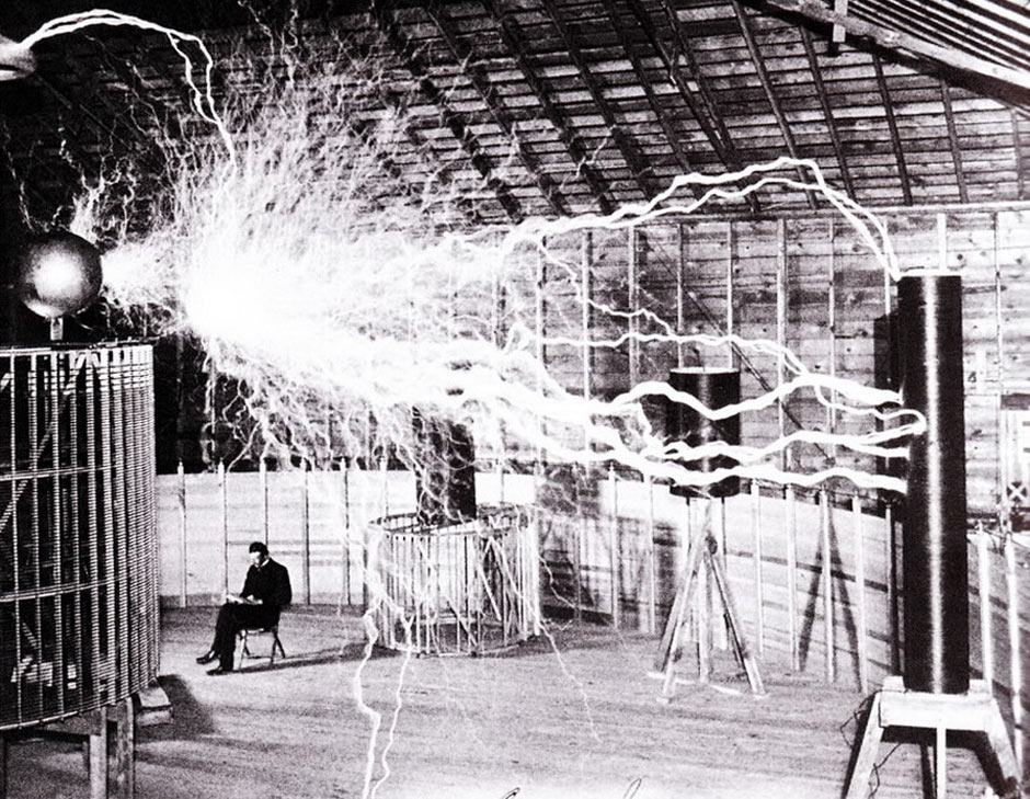
Nikola Tesla and the Myth of the Lone Inventor
article by: PACIFIC STANDARD
http://www.psmag.com/science/nikola-tesla-edison-inventors-apple-samsung-54501/
COPYRIGHT © 2013 · PACIFIC STANDARD
“The scientific man does not aim at an immediate result,” he wrote in 1900. “He does not expect that his advanced ideas will be readily taken up. His work is like that of the planter—for the future. His duty is to lay the foundation for those who are to come, and point the way.”
- Tesla
http://www.psmag.com/science/nikola-tesla-edison-inventors-apple-samsung-54501/
COPYRIGHT © 2013 · PACIFIC STANDARD
GSF2013: young people thinking outside the box
Google Science Fair
https://www.googlesciencefair.com/en/2013/
It's an online science competition, open to students between the ages of 13 and 18 from around the world.
...and more!
https://www.googlesciencefair.com/en/2013/faqs
https://www.googlesciencefair.com/en/2013/
It's an online science competition, open to students between the ages of 13 and 18 from around the world.
...and more!
https://www.googlesciencefair.com/en/2013/faqs
Friday, September 6, 2013
SmartWatches: the phone on your wrist
GIZMODO article:
Qualcomm Toq:
http://gizmodo.com/qualcomm-toq-hands-on-this-is-tonnes-better-than-the-g-1262608083?utm_campaign=socialflow_gizmodo_facebook&utm_source=gizmodo_facebook&utm_medium=socialflow
Samsung's Galaxy Gear:
http://www.gizmodo.co.uk/2013/09/galaxy-gear-everything-you-need-to-know-about-samsungs-smartwatch/
COMIC BOOK GIFs!!!
The CreatorsProject: article about using GIFs as comic "book" enhancers
http://thecreatorsproject.vice.com/blog/schoolgirls-is-a-new-comic-in-gif-form
The next chapter of digital graphic novels may look a lot like those by French animator and illustrator, Stephen Vuillemin. His comic, Schoolgirls, utilizes gifs to infuse panels with bursts of animation. The tenth and final episode in the 300 GIF series premiered this week as part of the Arte supported publication, "Professor Cyclope."
"I read comics very fast. I don't spend a lot of time looking at the pictures," explained Vuillemin. "I wanted my readers to be able to do the same with my comics, despite the animation. So I came up with some rules. One: if there is a speech bubble, it stays on for the loop, so that the reader doesn't have to wait for it to appear to read it. Two: a single frame of each picture should give enough information to understand the action. The animation is kind of a "bonus" to it, but you should be able to read it without looking at the animations."
the car commercial by Casey
Gizmodo
http://gizmodo.com/how-casey-neistat-shot-an-amazing-car-commercial-with-z-1253143554?utm_campaign=socialflow_gizmodo_facebook&utm_source=gizmodo_facebook&utm_medium=socialflow
Casey Neistat: We started with video 1, which was about describing the why, you know, why would I do the campaign and what does Mercedes-Benz mean to me personally? Video 2 is about us actually discovering the car. Video 3 is following us discovering and creating this commercial. Video 4 is the commercial.
YAHOO! logo: new (video)
GIZMODO article:
"The new logo was designed by an in-house team at Yahoo, and it's based on a typeface designed by Hermann Zapf in the mid-1950s called Optima. The design team chose to add quite a bit of depth to the mark, both through shadows and through an extruded line that runs down the middle of each character. The result is jarringly three-dimensional, and paired with a blinding new hue of purple, was clearly designed to stand out on mobile screens."
video link that GOOGLE refuses to acknowledge as a working link:
http://youtu.be/_0b6qaPY-CQ
http://gizmodo.com/yahoos-new-logo-is-a-bore-and-thats-the-whole-point-1255515185?utm_campaign=socialflow_gizmodo_facebook&utm_source=gizmodo_facebook&utm_medium=socialflow
Subscribe to:
Comments (Atom)
